Using What We Have to Hand: printing Moresong at the 1in12 Club
Becca Drake (editor and printer, Little Hirundine press) and David Mullin (editor and printer, Fflwcs press)
This blog is an account of printing the Moresong Christmas pamphlet, 2025, on a newly-restored Arab press at the 1in12 Club in Bradford. The Club’s Print Collective have been grateful to have had the help and support of the wider letterpress community, which has included generous donations of type, equipment and knowledge without which it would not have been possible to get the press operational again.
The car comes out of nowhere, in the temporary confusion of stuck traffic lights on the outskirts of York. I slam my foot on the break, bringing my hatchback to a stalling stop. The other car drives past, horn blaring. In the aftershock of near collision, I pull down a side road and swear. Despite my best efforts to secure it by wedging either side of the type block with books and paper and my spare wool hat, the text I so painstakingly set last night, staying up to the early hours with old television re-runs to get it finished, is half in ruins. The right-hand margin scatters the footwell, line breaks chaotically interrupted. I scoop what letters I can back into place, making a small mound of metal to fit again into the puzzle of lines, later with the help of coffee. When I get to Bradford, where I am working with the 1in12 Club’s David Mullin to print a poetry pamphlet for local poetry reading series Moresong, I carry the semi-discarded type block up four flights of narrow stairs and lay it on the table. ‘It could have been worse,’ I say. It takes two hours to fix the type block before we can get on with the day’s printing.
There is nothing easy about printing poetry letterpress. It is a slow, laborious process, prone to mistakes, messy and frustrating. It takes a long time to set and print a page, then a book, and even once this is printed, small print runs mean a likely narrow readership. If printing poetry by hand is difficult, especially compared to commercial printing, then why do it? One reason must be the particular connectivity offered by composing and distributing poetry in this way – connections with past small press movements, chains of touch between poet and reader, and the reading communities of decentralised alternative poetry networks that thrive on the exchange of ‘homemade’ books.
There is a long history of small press hand printing in the north of England. As we work, tinkering to fix letters out of place and upside down, David tells me the history of printing at the 1in12 Club. Sometime in the early 1990s, a printer called Peter Good donated a nineteenth-century Arab treadle press to the Club, having rescued it from a skip outside a local printers’ shop. He also donated cases of type and equipment rescued from other printers who were at that time converting to digital processes. Ironically, despite the current buzz among poets and small presses to work with letterpress and the material book, there was a time not so long ago when a similar clamour to work with digital print processes threatened to make traditional print craft obsolete. Printers cast presses, other printing equipment, and whole cabinets of type into the street. People like Peter Good salvaged them and kept the craft alive. For Peter, this meant using his salvaged print equipment to print The Cunningham Amendment, which he called a ‘subversive, anarchist’ publication and was a development of his earlier publication Anarchism Lancastrium. Both were printed on recycled papers, such as toilet paper and old computer punch cards, and included print ephemera such as anti-fascist beermats and revolutionary stickers. The Cunningham Amendment ran to twenty-one volumes over fifty years. You can view copies in the John Rylands Library, Manchester.
Stories like that of Peter Good demonstrate how previously discarded print equipment provides a way of printing cheaply; The Cunningham Amendment is one of many such alternative literary magazines and small press endeavours produced by hand in the late twentieth century (other notable examples include the work of Bill Griffiths through Pirate Press then Amra Imprint, and Jon Silkin through Northern House) which created their own space outside of central poetry publishing. Today, using Peter Good’s donated press means that David and I can create an original poetry pamphlet very cheaply. Printing in this way can be a practice of using what you have to hand and making do.
Peter Good’s print work was part of a larger movement of northern small press typography in the ‘90s. He was a friend and collaborator with poet and writer Dave Cunliffe, who ran Blackburn’s alternative bookshop Amamus. Both worked as part-time nurses in the Ribble Valley, where Peter received a doctorate writing about alternative forms of mental health treatment. One of his schemes to improve the mental health of Bradford residents was to wallpaper and plant flowers on top of a run-down bus shelter. He later moved to Norfolk. Dave went on to establish PoetMeat, an international journal of avant-garde verse and esoteric articles. He coined the phrase the ‘British poetry revival’, which gained broad currency over the 1960s and ‘70s. PoetMeat was one of a huge number of ‘little magazines’ produced over that period which were responsible for a democratising of the British poetry landscape.
Meanwhile, in Bradford, Peter Good didn’t want to transport a half-ton printing press all the way to Norfolk. So members of the 1in12 Club moved the press the shorter distance from his house in south Bradford to the Club’s building in the city centre. It became a central part of the Club’s existing Print Collective and was used to print publicity and membership cards, as well as beermats for the annual hardcore punk festival Means to an End. But when the Print Collective eventually folded in 2013 the press lay unused in the cellar. This is how I first found it when, behind the scenes at a Moresong poetry reading event being held at the 1in12 in February 2025, David claimed there was a printing press in the cellar. I thought he was probably talking about an old screen printing bed gathering dust and moths, or a bashed-out table top press. I wasn’t expecting to see, mostly hidden among boxes and crates of pop, the hulking iron frame, like a person bent double, flywheel detached and leaning against the brick wall. Over the next few months, plans were made by David and the Print Collective to move this press out of the cellar and rehouse it in a small room on the top floor of the Club’s building. David has since told me of the exhausting process of lugging the iron press, in parts, up the fire escape and reassembling it again. When it was first made, the press was supplied in kit form, like a piece of IKEA furniture, along with a man who showed up to help put it together. It was claimed that ‘any man [sic] competent with a screwdriver’ could assemble and maintain an Arab Press.
By the time I arrived at the 1 in 12 in the Autumn of 2025 to learn how to use the press and start printing, it looked twice the height, with the flywheel reattached and spinning freely. The press was made in 1884 by Josiah Wade of Halifax, probably in the Hope Works on Arundel Street. Wade was born in Hebden Bridge and was an entrepreneur and inventor who patented this press design, based on an American design by H.S. Cropper and Co., in 1872. Around 40,000 were built between 1872 and 1959, when production ceased in Halifax. It is a clamshell platen design, where the type is held in a chase on the bed of the press and the paper is fed onto an opposing plate which closes against the type, inked by rollers. You operate it by a foot treadle, levering your body between this and your hand on the flywheel so that you move in a kind of dance which, if you could keep up, would allow this machine to print 1500 pages an hour.
The press now sits in a room on the same floor as the 1in12 Club library, which hosts poetry and spoken word events and houses one of the largest collections of anarchist literature in Europe. Since 7th June 2025, when the first ink went on the newly-restored press, it has been used in community events to engage a new generation of printers, such as the Print Collective’s open day on 19th July, printing original postcards inspired by Lawrence Ferlinghetti. Now, David and I are here in the Winter printing the first poetry on the press since its use in the ‘90s – a Christmas Song pamphlet to raise funds for the Moresong poetry reading series that has been run by Tom Branfoot and David Dobson since 2023. After taking place at various venues around Bradford, the series found its home in the 1 in 12 Club library in November 2024. We are printing this pamphlet to raise funds for next year’s reading series, to sustain an important space in the northern poetry community. Community, skillshare, and the free exchange of knowledge is at the heart of this project and of the 1in12 Club. We can produce this pamphlet for very little cost by printing a small print run – an edition of 50 – working for free and sourcing materials spare from each of our own small presses. We are combining our skillset – David’s knowledge of the Arab press and the 1in12’s collections, and my experience printing letterpress poetry pamphlets.
In a nod to letterpress poetry history, we have based the pamphlet’s design on the Ariel Poems published by Faber and Faber between 1927 and 1931, printed at the Curwen Press. Each numbered pamphlet had an illustrated cover naming the author and illustrator, and four pages (an A4 sheet folded down to A5) were sewn inside the cover. The series included The Cultivation of Christmas Trees and The Journey of the Magi by T.S Eliot, as well as poems by writers as diverse as W.B Yeats, G.K Chesterton, Walter de la Mare and Edith Sitwell. Illustrators included David Jones, Eric Ravilious, Paul Nash, Graham Sutherland and Eric Gill. The Ariel Poems were intended as illustrated pamphlets on holiday themes, to be sent to Faber’s clients and business acquaintances as Christmas greetings. Back in David’s studio in Hebden Bridge, we pored over The Journey of the Magi, reading this collaboration between T.S. Eliot (as poet) and David Jones (as illustrator) not just for its contents but for its touch. The covers are soft, bendable, the colours of the paper are warm-hued in contrast to the chilly tone of the text, and the type-setting allows the poetry space to breathe on the page. It is a small book, of just four pages, but it invites being held and encourages spectacle. This is not a thing to be put down again too soon.
Inspired by the warm materiality of the Ariel Poems, David and I planned the Moresong pamphlet from the paper up, building a book before any words were involved. By the time we spoke to poet Ian Humphreys to commission his poem December Song that is printed in the pamphlet, the book was already half-written through its material design. The pamphlet is also illustrated by Louisa Amelia Albani. Louisa is based in London and runs Night Bird Press, which is inspired by the English tradition of writer and artist independent presses like Virginia and Leonard Woolf’s Hogarth Press and William and Catherine Blake’s publishing enterprise. Lousia’s style very much echoes that of the Ariel pamphlets and we were keen to work with her on our pamphlet inspired by these. Ian’s poem is an ode to Kate Bush, recalling the moment in childhood when the poet first saw her appear on Top of the Pops and fell in love. The image of a Kate Bush Christmas bauble centres the poem, observing Kate in glimpses of a ‘Black floor-length dress. This image is repeated in Louisa’s illustration, which zooms in on the pop star to show her peeking through the branches of a Christmas tree. Black nail varnish. Red rose’ and ‘auburn hair’ like the bauble peeking through the leaves of a Christmas tree. It is a prose poem. When Ian sent it to us, it was set across one A5 page, but in the printed pamphlet the poem is spread across two pages. In a meeting with Ian, I explained the method of letting the composing stick (a tool used to set lines of type in letterpress printing) decide line breaks, something I first experimented with when setting Alex Priestley’s long poem sequence Dérive. Like Ian’s poem, Alex’s poem uses the prose poem form, which is typically presented in a justified type block – as readers, we recognise a prose poem by its box form and lack of deliberate line breaks. (Of course, even a justified text has line breaks.) For the Moresong pamphlet, we put line breaks back into the prose poem, collaborating with the composing stick to decide where these should fall. We set the stick at 18ms (about 10cm) because we had enough leading (metal strips to hold the type in place) of this length to set the complete poem. We made do with the materials to hand. The length of the poem’s lines was therefore limited to about 10cm, and the process of deciding where to break a line was to fill the line with as many words as would fit before moving on. In places, the human editor (myself or David) jumped in to break the line in a way that made more grammatical sense, such as ‘Red rose / inauburn hair.’ Had we filled the composing line entirely, we could have broken the poem line ‘Red rose in / auburn hair’. To break after ‘rose’ reads better. Incidentally, the nonsensical compound ‘inauburn’ is a typo and a mistake, but one that perhaps remains in keeping with the poem’s playful tone. We set the prose poem of the Moresong pamphlet with a left-aligned margin and ostensible line breaks to play with questions of form: What really makes a prose poem? Is it justified by its blocky form or are there more things at play, such as musicality, tonal expression–a certain detachment–and an elasticity of how the ideas are woven together? We write with the physical tools of letterpress printing to disrupt Ian’s original poetic voice, making the final printed poem a multi-directional collaboration between poet, editor, typesetter, and printing instrument.
At the beginning of this blog, I acknowledged that printing poetry letterpress is a slow, messy, laborious and frustrating pursuit, and asked why we should bother to work with poetry in this way. The embodied formal constraints of letterpress offer a paradoxical compositional freedom and a prolonged engagement with the poem. Working in this way asks us to form the poem slowly and deliberately, while also embracing inevitable human error and the random influences of materials and space (of the page) on a poetic text. More than this, each new letterpress publication connects back to a history of printing letterpress poetry in the British Poetry Revival and, beyond, to Modernist bookmaking. Printing poetry in this way is a practice of collaboration and building community. The final pamphlet is sold via our networks through word-of-mouth, each time with a conversation about the printing process, the poem, and Moresong. Copies are also kept as part of the 1in12 Club’s growing small press library. We distribute the pamphlet to build connections and further conversations about poetry and the history that inspires it.
We print poetry in this way because it allows us to work together deliberately, playing with history, embracing error, and holding the door open for future poetry communities. We hope that, having shown how poetry can be printed at the 1in12 Club, future print endeavours will continue here. Perhaps we will be able to teach a new generation of poets how to print books using whatever they have to hand, and who knows what unexpected poetry might then come of it.
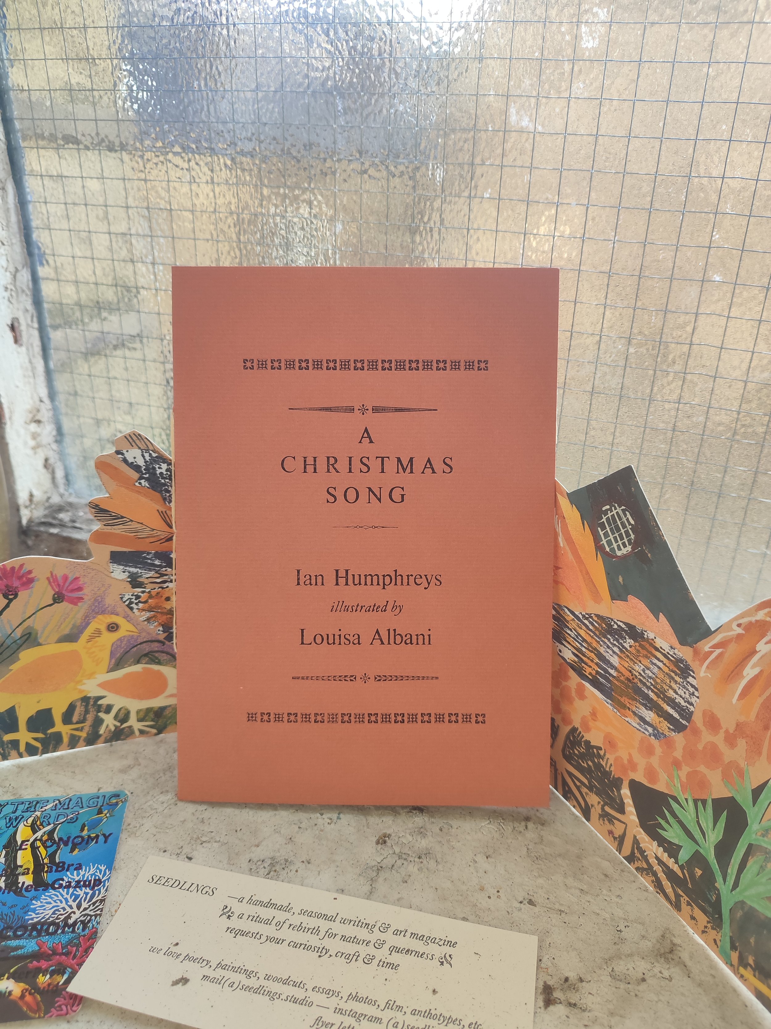
Handprinted Moresong pamphlet, ‘A Christmas Song’, with poetry by Ian Humphreys, illustration by Louisa Albani, printed and bound by Becca Drake and David Mullin.